Your bio link is often the first “website” a new follower sees. Before they read your latest post, watch your newest video, or check out your shop, they land on one small page that has to do a big job: introduce you, guide them, and get them to act. That’s why link-in-bio design trends are moving so fast and why creators, coaches and brands are reconsidering how this one link works for them.
In the early days, a bio link was a plain list of URLs stacked on top of each other. Click, scroll, click again; that was the whole experience. That simple list has today morphed into a mini website builder, personal brand website and one-page website all rolled into one. It's smarter, faster and a lot more visual.
In this blog, we’ll take a look at the top 10 link-in-bio design trends for 2026, why they matter, what mistakes to avoid, what features to look for in a link-in-bio tool, and how to future-proof your bio page builder strategy for the years ahead.
Why Link-in-Bio Pages Are More Important in 2026
The creator economy has become far more than a niche hobby; it’s now a full-time career path for millions of people. As more creators, coaches, freelancers and small businesses build an audience online, the need for one clean, trustworthy hub has never been greater.
Getting a head start on these link-in-bio design trends gives creators and brands an edge over competitors who are still using old, static link listings.
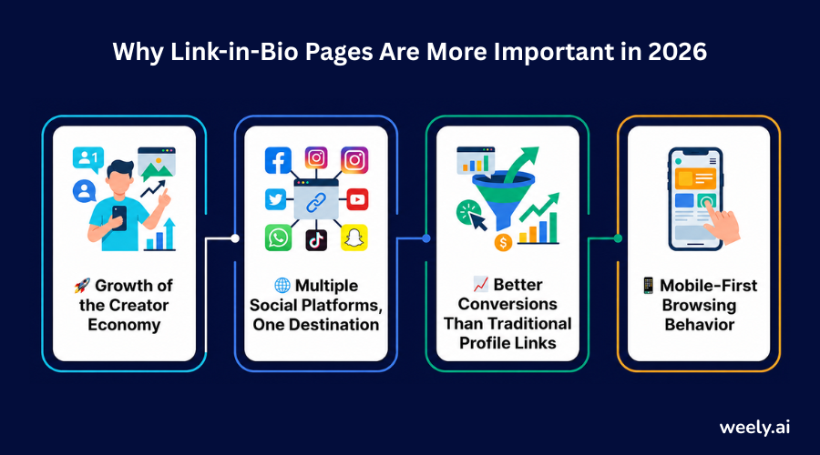
Growth of the Creator Economy
There are more people publishing content on Instagram bio generator, TikTok, YouTube and podcasts than ever before. A well-designed social bio page has become essential infrastructure for anyone monetizing their audience through digital products, coaching calls, affiliate offers or brand deals, with only one clickable link per platform.
Multiple Social Platforms, One Destination
People may find you on TikTok, then follow you on Instagram and then discover your podcast on Spotify. A social media landing page consolidates all of these touchpoints in one place, so no matter where someone finds you, they land somewhere consistent and organized.
Better Conversions Than Traditional Profile Links
A raw single link in a bio says nothing to a visitor about what to expect. A structured creator landing page creates context, trust and clarity before asking someone to click, naturally driving higher conversion optimization and stronger click-through rate performance.
Mobile-First Browsing Behavior
Phones generate almost all bio link traffic. Some visitors even scan a QR code to get there instead of tapping a profile link, so fast loading is even more important. That’s why every serious mobile-first landing page in 2026 is thumb-first, with big tap targets, fast loading and zero horizontal scrolling.
10 Link-in-Bio Design Trends for 2026
Today's best bio link page does a lot more than just list URLs. Combining smart layout, AI link-in-bio technology and behavioural design to convert casual visitors into loyal followers, subscribers and paying customers. Whether you’re comparing existing tools or building your own custom bio page from scratch, here are 10 link-in-bio design trends to build into your page this year.
These link-in-bio design trends can be used alone or combined for even greater impact.
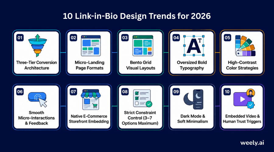
1. Three-Tier Conversion Architecture
High-performing pages now cluster links based on discovery, engagement, and conversion, rather than treating all links equally. A first-time visitor may be browsing (discovery), a returning fan may want to join your newsletter (engagement), and a ready buyer wants your product page (conversion).
This structure offers a clear path from the first click to the last action. Instead of just posting ten random links in no particular order, the page is structured to have the high-value actions at the top and supporting content further down, much like a well-organized link-shortening dashboard helps you keep your most important destinations easy to find. The experience is smoother and more deliberate, which is a good practice in profile optimization found on full websites.
2. Micro-Landing Page Formats
The modern bio link page is beginning to look less like a list and more like a small website. Creators now have dedicated sections for products, services, portfolios and featured content, instead of one link per line. This format makes their page a mini website builder experience.
This format allows visitors to find exactly what they need without having to leave the page. If someone wants to book a service, they can scroll to that section, and if they want to see your latest YouTube video, they can easily find that too. A dedicated Instagram bio link section keeps that audience moving toward the right content. Content blocks like this increase time on the page and overall audience engagement.
3. Bento Grid Visual Layouts
Inspired by modern web and app design, bento grid layouts arrange content in cards of varying sizes, like a food tray with compartments. This naturally creates a visual hierarchy that leads the eye to your most important content first.
Bio page builders with bento-style layouts will enable you to combine images, embedded videos, links, and CTA buttons all in one organised, scannable view. A well-designed social media bio page transforms a simple list of links into a polished, engaging, and interactive experience.
4. Oversized Bold Typography
Big bold headlines are taking over bio pages in 2026. Big type tells people what your brand is in the fraction of a second before they decide to scroll or bounce, and that’s huge on a teeny mobile screen.
Oversized text also makes things easier to read. Your visitors won’t have to strain their eyes to see who you are and what you’re offering. But bold typography isn’t just a pretty face. It makes key messages and CTA buttons impossible to miss – a simple, yet powerful, improvement to conversion optimization.
5. High-Contrast Color Strategies
Color is doing more strategic work on bio pages than ever. Smart, contrasting color combinations direct users to key actions, and the best creators have a strategy beyond aesthetics.
Strong contrast also helps make pages more accessible and easier to read for visually impaired visitors. On a well-designed custom bio page, creators use contrast to highlight buttons, separate sections, and build a color palette that feels memorable and branded rather than generic. Pairing these design choices with a campaign link generator also makes it easier to create trackable links that fit seamlessly into your branded bio page while improving campaign performance and user experience.
6. Smooth Micro-Interactions & Feedback
Subtle animations such as a button that expands a little when tapped, an icon that shifts a little, or a soft hover glow are now a common thing in premium bio website design. These micro-interactions provide instant feedback to visitors and confirm the tap was successful.
And these small details give a page a fresh, modern and active feel. They improve the user experience without slowing down the page. They also make the design fun and easy to use. It is not about fancy animation. It is smooth and useful feedback that is supporting usability and keeping the page speed intact.
7. Native E-Commerce Storefront Embedding
The shopping link is in the bio. Instead of pushing visitors to a different store, more pages now embed products within the page itself, creating a seamless native shopping experience.
This goes for physical products, digital downloads, service bookings and affiliate offers too. An embedded shopfront turns your online link hub from a simple directory of outbound links into a revenue channel by reducing the number of steps between discovery and purchase. Many sites now pair this setup with a QR code generator, enabling customers who are physically present to scan their way directly to a product or checkout page.
8. Strict Constraint Control (3 - 7 Options Maximum)
More choice does not equal more clicks; often it means less. Behavioral research has repeatedly demonstrated that too many choices overwhelm people and slow down decision-making. This is exactly why the most converting bio pages in 2026 intentionally restrict themselves to 3-7 core options.
That forces creators to prioritize only their most important links, to adopt a focused CTA strategy, and to cut anything that isn’t pulling its weight. Ironically, a tighter list usually makes a better, high-converting link-in-bio page than a crowded one.
9. Dark Mode & Soft Minimalism
Dark mode is no longer a simple “nice to have” feature. It is now chosen by many visitors as their preferred design. Soft and minimal layouts work well with dark backgrounds. The layouts give off an upscale, tranquil vibe. This style works great for both personal brands and businesses.
Clean layouts mean fewer distractions. They load quicker. They provide a smoother reading experience across smartphones and tablets. Providing both a light and dark theme provides users with more options. Instead of making every visitor have the same look, a personal brand website can cater to several viewing tastes.
10. Embedded Video & Human Trust Triggers
Short embedded videos, a quick hello, a product demo, or a behind-the-scenes peek are becoming standard features on modern bio pages. Video establishes an emotional connection quicker than just text and allows visitors to feel like they know you before clicking anything else.
Testimonials, reviews and other social proof elements are also trust triggers that help new visitors to feel reassured before they commit to a purchase or sign up, in addition to video. Together, these things boost trust and overall audience engagement, especially for a digital business card used in a professional or sales context.
These 10 link-in-bio design trends show how far bio pages have come from their simple list-based roots.
Essential Features Every Link-in-Bio Tool Should Offer in 2026
Link-in-bio tools are not all created equal. Some are little more than a stack of buttons; others are closer to a real smart link management platform with an AI-powered link-in-bio builder built in or even a full bio page creator. Before you decide on one, make sure it really does these basics:
- Unlimited links: You shouldn’t have to delete last month’s content to make room for new stuff.
- AI assistance: Real AI link-in-bio that helps with copy and layout decisions, not just a gimmick slapped on a template.
- Analytics dashboard: Enough detail to see which links people actually click once you create a free bio page.
- Custom domains: Branded URL for your bio website instead of a subdomain.
- Mobile optimization: Because almost everyone will be looking at your page from a phone, not from a laptop.
- Integrations: Connections to your email platform, store, chat tools and whatever else you consider your marketing tools for creators.
- SEO settings: Meta titles and descriptions are controlled so that the page can actually be found.
- Fast page speed: Because a slow bio page loses visitors before they get to see what you have to offer.
A tool that covers all of this stops feeling like a basic link list and starts working more like a genuine smart link sharing platform, or what some people call an online profile and resource hub. Picking one that already reflects current link-in-bio design trends means you won't be scrambling to switch platforms a year from now.
Common Link-in-Bio Design Mistakes to Avoid
Many pages still stumble on the basics even when the creator has good content behind them.
- Too many links: All your links on the page are being sprayed on the page instead of directing visitors to the ones that count.
- Poor CTA placement: Hiding your most important action under less relevant clutter.
- Slow-loading pages: Typically, this is due to large images, unnecessary scripts, or inexpensive hosting.
- No branding: Using a default template anyone could get.
- Ignoring analytics: Never looking at what’s really converting, so the same mistakes are made month after month.
- Non-mobile-friendly design: Small buttons and cramped text that will not fit on a small screen.
None of these mistakes are hard to fix once you know they exist, and fixing them often does more for your results than any new feature could. Avoiding these mistakes is just as important as embracing the new link-in-bio design trends we discussed earlier.
How to Choose the Right Link-in-Bio Tool
With so many link-in-bio builders on the market now, everything from long-running platforms to newer AI-powered options, it's easy to get overwhelmed by choice. A straightforward checklist allows you to navigate the options and evaluate tools based on their relevance.
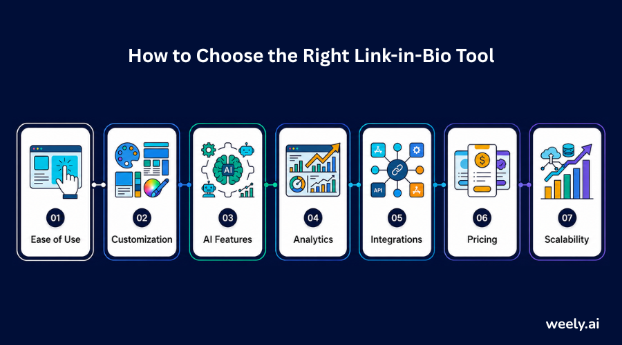
- Ease of use: You shouldn't need a developer on speed dial just to update your page. If it takes more than a minute or two to change a link or swap an image, then the tool is working against you.
- Customization: Your page should be able to evolve with the latest design trends, bento-style grids, bold typography or whatever matches your brand, rather than forcing you into one inflexible template.
- AI features: There’s a huge difference between real AI assistance and a template picker with an "AI" sticker on it. Search for tools that can help you write copy, suggest layouts or optimize based on the behavior of your visitors.
- Analytics: You want to see more than just total clicks. That’s the kind of detail that tells you what to fix: which links convert, where your traffic drops off and how visitor patterns shift over time.
- Integrations: Your bio page doesn’t have to be an island. It should play well with your email list, your store, and anything else you already use to run your business.
- Pricing: Spend a few minutes comparing the free and paid bio page plans against your actual budget and goals, not just the cheapest option on the page.
- Scalability: What you need today, you won’t need in a year. Pick a platform that will grow with your audience, not one you’ll have to change down the road.
Future of Link-in-Bio Pages Beyond 2026
Looking further ahead, the next generation of the bio page builder category is likely to be even more heavily weighted toward automation and personalization:
- AI-generated layouts that automatically resequence sections to convert best for each visitor
- Voice search optimization, as more and more discovery is done through voice assistants and conversational search
- Interactive shopping, with live product data, reviews and checkout, is embedded into the page itself, often triggered by scannable QR codes placed on packaging, posters, or events.
- Personalized user journeys, where returning users see different content than first-time users
- Automation, connecting your bio page directly to email sequences, CRMs, and sales funnels; no manual setup required
These changes mean that bio pages are turning from static link lists to smart, self-optimizing creator landing page systems, making current Link-in-Bio Design Trends future-ready.
Final Thoughts
All of the top link-in-bio design trends for 2026 are heading in the same direction: less clutter, more intention. From three-tier conversion architecture to bento grid layouts and embedded video to native shopping, each trend on this list is designed to help visitors find what they need faster and take action with confidence.
If your bio link now looks like a bunch of URLs, now might be a good time to refresh it. With a good link management tool and a smart bio page builder strategy, you can turn a small slice of digital real estate into one of your most valuable marketing assets; no big redesign required, just a few intentional updates inspired by the ideas above. When you’re ready, you can create your page and start implementing these trends today.
FAQ
What is a link-in-bio page?
A link-in-bio page is a single landing page that you can click on. It puts all your important links in one place. These can be social profiles, products, content and others. Most social media sites only let you have one clickable link, so this page makes it easy to share.
How do I create a link-in-bio page?
To learn how to create a link-in-bio page, first choose a bio page builder. Use link analytics to track performance over time. Then add your branding with colors, fonts and images. Finally add your key links in order of importance.
What makes a link-in-bio page high-converting?
There are only a few clear options for a high-converting link-in-bio page. It also places the most important CTA at the top. It’s also high-contrast and has clear typography. Testimonials or videos, for example, can increase trust and get better results.
Is dark mode important for a bio page?
Dark mode is not necessary. But having it gives visitors more choice. It caters to different viewing habits. So a bio website can look more modern and premium.
Can I sell products directly from my bio page?
Yes. Many of the modern bio page builder platforms also offer native embedding for e-commerce shopfronts. So you can sell physical products, digital downloads or services. Visitors don’t need to leave your bio page.
What's the difference between a link-in-bio tool and a personal website?
Link-in-bio tools are typically the easiest and fastest way to launch vs a full personal brand website. They are designed to organize links and drive clicks. A personal website gives the full multi-page experience.